Part 2: Did you distribute my data?

In continuation to the distribution plots, lets take a look at a few more complex distribution plots that provide more information in one go.
PAIRPLOT


Description:
itakes as input a Data Frame to plot. By default, it plots histograms across the diagonal and scatter plots in all the other grids. This gives us a clear view of how the data is distributed in the dataset. For instance, we can see that Price and SQFT_Living clearly have a Linear Relationship and so on.

This takes either 'scatter' or 'reg' as parameters. REG is used to draw a regressino line ito show id there is any linear relationship.


This takes either 'hist' or 'kde' as input. As shown, when kde is used, it plots a kde plot instead of histogram.
hue:
This should be another column from the dataframe being used and this will act as a color differentiator.
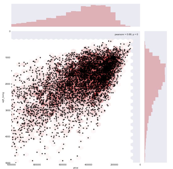
JOINT PLOT
Bi variate distribution of 2 observations is visualized using this plot. By default, a scatter plot is used along with histograms.


This plot encompasses a scatter plot for the 2 observations supplied as x and y values on the given dataset along with histograms.
size: Used to increase the size of the graph.


This could be one of the following: scatter, kde,hex,reg or resid


jointplot returns a JoinGrid object and hence we could use this to transform the graphs further. Its the same with pairplot as well.

Comments
Post a Comment
Hey there, feel free to leave a comment.