Part 1: Interactive mapping using Folium

FOLIUM - Mapping Library
By default the Python distribution won't ship with Folium. This can be installed as shown below.
Now that we have it installed, lets draw some maps. We will be using Indian Poling Stations information for these posts.

folium.Map() will create a Map object which will alter be used to add more meaningful data to it. This image can be zoomed in and out to focus on specific regions.

Description:
location: tuple or list of latitude and longitude are provided as input
zoom_start : Defines the initial zoom level

Description:
tiles: Used to plot a variety of maps using different tile sets. For instance another popularly used tile is "Stamen".
The one we use above wont display the names of the places in their regional languages like the default tile which is "OpenStreetMap".
A snippet of the dataset we will be using is shown below.


Description:
We first create a map of India with an initial zoom level. Then create a FeatureGroup object to add mode details to the map. CircleMarker is used to create circles for each of the latitude/longitude pairs. And finally add the newly created circles (marker) to the map for each latitude/longitude pairs.

Up on zooming a bit we get:

We can add information to these circle markers to make them more informative.


Description:
All we need to do is use the popup parameter of the CircleMarker to add a label to each circle. In our case, these labels are the Polling Station names from the dataset.
Suppose we want to see the actual latitude and longitude values of each marker we can do as shown below:


First we create circle markers as usual but without the popup feature. To add the latitude and longitude data to each marker we can use LatLngPopup().
We all like the balloons in Google Maps. Don't we? The same feature can be added to our maps as well.


Description:
Like we have seen above, circles are created first (this step is optional, we can create the balloons directly if we wish) . Marker along with its parameter popup (in our case is assigned to PSName, that is Polling Station Name) used to assign each latitude/longitude pair with a label in our case the polling station name and added to the Map object.
These balloons are interactive, meaning if we click one, it will display the label associated with it.
CHOROPLETH MAPS
These are the maps where each region is marked according to the varying intensity of the color map associated with a specific statistical measure.

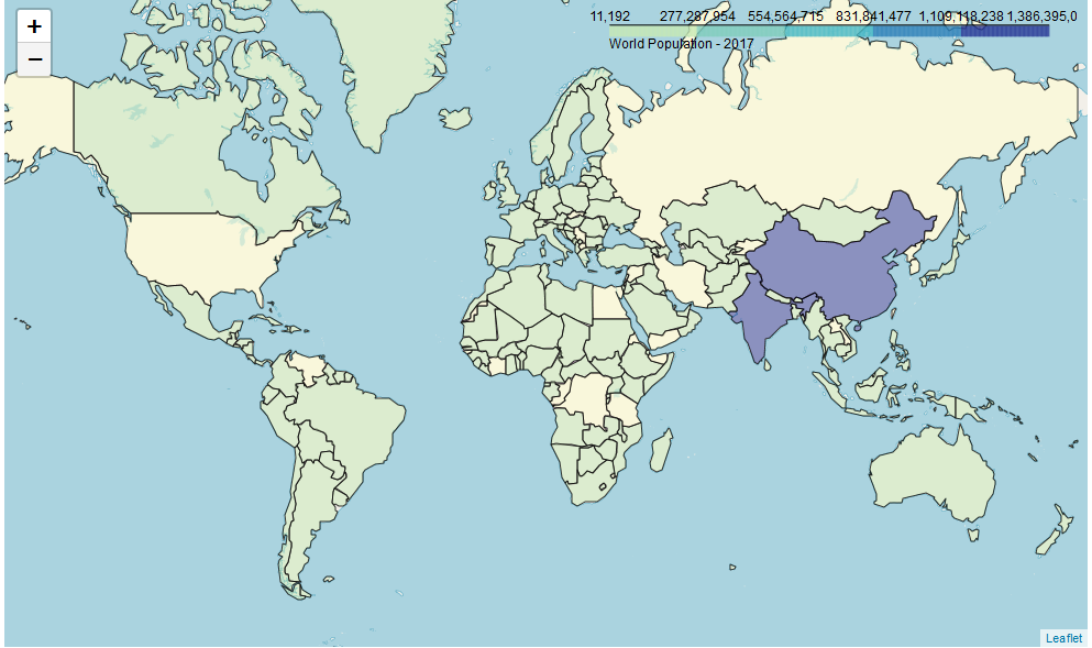
Description:
With any other maps we draw using Folum, we first create a Map object. Not the location we are using is latitude 0 and longitude 0. An interesting read is give below for reference
" Zero degrees latitude is the line designating the Equator and divides the Earth into two equal hemispheres (north and south). Zero degrees longitude is an imaginary line known as the Prime Meridian."
Lets define each parameter of the choropleth() of the map object used to draw chropleth maps.
geo_data: A JSON file having the latitude and longitude values of countries in our case. Sample JSON data is show at the end of the post.
data: Actual dataset being used
columns: The columns of the dataset used in plotting
key_on: The key to refer in JSON file
fill_color: This will act like the color map. Refer to the color brewer here - http://colorbrewer2.org/
highlight: This enables us to click each region, which by default is disabled.
Threshold_scale: Acts like the scale for the color map.
Note:
The threshold_scale has to be <= 6 items. If the default scale isnt good enough, it can be customised as we did in the first 3 lines of our code. If the number of items is > 6 we get the below error while plotting the map.


Comments
Post a Comment
Hey there, feel free to leave a comment.