Part 1: Did you Distribute my Data?

Suppose you're given a task to create a machine learning model to predict house prices or say predict the trajectory of a satellite (its me being cheeky here, but not lying. This happens in real world usecases), the first step in this pursuit is to GET A SENSE of data. What is this data about? How is it distributed? As always, seaborn has anothr ton of plotting optinos to understand the distribution. Ton + ton + ton + ....? Seaborn needs a weight controlling mechanism.
DISPLOT


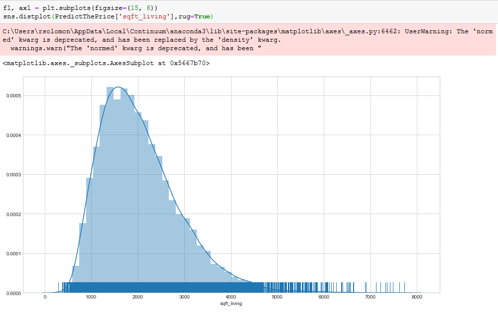
rug=True: will enable a feature of RUGPLOT which will be discussed later. The data points are drawn as small lines in the graph,
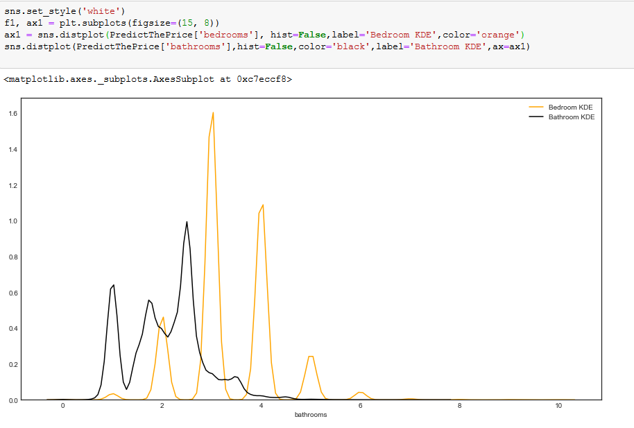
We can draw multiple KDEs in asingle plot as shown above.
KDE PLOT
We have seen a mammoth above, now discussinb about just the KDE will look small here. But to express my love for seaborn, let me show how a KDE plot is drawn.

kdeplot() ships with many options. It takes in one or two data arrays as input to plot the graph. As we can see, 'tip' from the tips data from earlier is being used here.
shade=True: As the name implies, this will fill in the area of the plot. Looks similar to area graphs in general.

Now to make things a little more complicated, we can use 2 input data arrays as shown above. This show how the KDE is distributed over the two input data arrays.
RUG PLOT
Lets see another plot which when used alone wont be significant. But when you combine it with KDE plots or some other plots (as shown in kdeplot section), they could prove very efficient.

We are using the tips_data here. As shown above, the total number of datapoints whose tip value is 10 are just 1. Must have been a super rich kid of the block :)
Also, the number of data points with tip equals 2 are 33, which indeed is the most common value in the dataset.

Description:
we supply the method with an input vector to plot. Customizations include plotting on y axis or changing the height of the lines and adding colors.
If you look at the bunch of lines at "2", they look dense, as if forming a bar like structure. That is because the number of datapoints with tip 2 are more. Whereas the line at 10 looks thin signifying that the total count is very less (1 in our case).
Comments
Post a Comment
Hey there, feel free to leave a comment.