Little cogs to describe the graph - Better

Annotations
What makes a graph looks more beautiful? After all the colors and lifestyles and markers styles used, the graph is still incomplete without the text strings that describe a specific characteristic observed within the graph.
Take a small usecase where we plot a COSINE graph for random numbers.
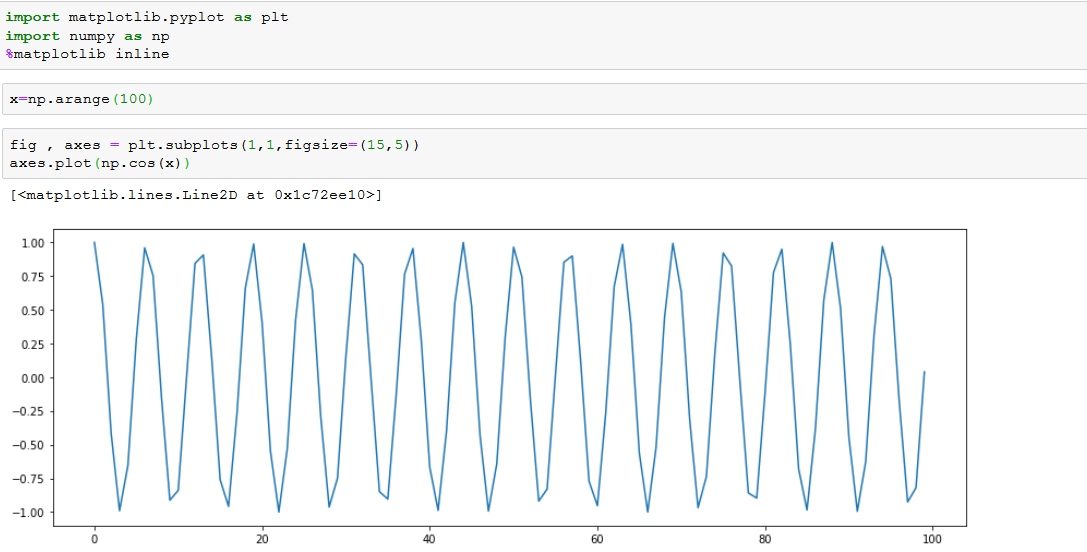
Its a simple plot of cosine(x) where x is an array of 100 numbers starting from 0. Now when we look at it, we know for sure when a cos values is 1 and when it is a 0. But if we want to explicitly mention that in the graph, we can use something called "Annotations" and "Text".

Description:
text() is used to write a text (to describe anything) string anywhere in the graph. Here i have used text() to write a string which says "Local Minimum for cos values at the bottom of the graph which signifies -1 value.
annotate() is used here to add in few more details like arrows to emphasize a specific observation in our case the local maximum or say when the cos value was +1.
A more general example would be: Suppose a bar graph of profits earned by an organization is plotted, and a significant rise was detected between 2014 and 2018, which is obvious from the graph but if an emphasis is to be made explicitly, we could use an arrow starting from 2014 to the top pf 2018 showing there was a GROWTH - an observation, in the graph.
xy = (0,1) : It means the arrow head has to point at "1" on y axis and it has to start from "0" on x axis
xytext = (20,1.01) : It means the base of the line has to start at "20" on x axis and at "1.01" on y axis.
xycoords = data : This is used to indicate the coordinate sysytem being used. There are few other options available.
Again, this could only be better understood upon practice. I had to do it a couple of times to gate a hang of the structure.
Ticks
Lets draw a graph first to explain what we can do with ticks in the graph.

X ticks are = 2.00, 2.25, 2.50, 2.75, 3...
Y ticks are = 0, 50, 100 ...
Supposes your creative mind wants to remove all the unnecessary labeling and just use the ZERO and MAX on the y-axis and START, RISE & END on the x-axis for a descriptive representation, we can make use of the following methods:


Description:
I know the x-axis starts with a 2, there is a rise at ~3 and a max value at 4 from the first graph. So i can re scale the XTICKS to have just 2,3 and 4 while removing all the other intermediate floater values. Similarly I know from graph 1 that the y axis has values ranging from 0 to 250 and I would like to just display the lowest values as ZERO and the maximum value as Max. hence i assign just 2 values to the YTICKS as 0 and 250.
Now comes the interesting part, we need to label these ticks per our requirement. For instance:
On x-axis : 2=Start, 3=Rise and 4= End
on y-axis : 0=Zero and 250= Max
These can be accomplished by using set_xticks(), set_xticklabels(),set_yticks() & set_yticklabels(). All of these methods take a list of values as inputs.
Spines
Matplotlib gives us the fine-grained access to literally every element on the graph. Suppose we want to manipulate the way SPINES of the graph behave. For instance, look at the below code and graph.


Description:
We removed the left y-axis spine and the bottom x-axis spine using spines['<<position>>'].set_visible() method
Colored the right y-axis spine in red and increased the size of the spine to '2'
Changed the line style of the x-axis top spine and increased the size of the line
Finally, we even switched the x and y tick labels from bottom, left to top,right respectively.
It doesn't end here, what if we want information on multiple spines?


Description:
twinx() and twiny() are the methods we use to create the twin spines. In our case, twinx() is used to draw 2 different plots (k, k cubed and k, tan(k+1) : just to make the graph look clearer). The corresponding values of k cubes are marked on y-axis left spine and the tan values on the y-axis right spine.
Comments
Post a Comment
Hey there, feel free to leave a comment.