Bars with Number Caps


Suppose, When i look at the first graph its easy to figure out what value on y axis corresponds to the values on x axis as there are no decimals on y axis. Pretty straight forward. Where as in the second graph, there are decimal values on y axis and it might be a little straining and requires keen observation to know the exact value corresponding to each value on the x axis.
A beautiful graph should be simple and informative. It should NOT be TAXING on eyes (or brain for that matter).
Lets see a snippet of the pulse values of exercise_data:

As you can see, the values are not sorted here but when you plot, the values on the x axis as shown in the first figure of the post, will be in sorted order since they are numerical values.

Our aim is to write as text the count values on each bar and we already know how to write text in a graph - using text() method. But how do you know the exact placement of the text to be written? Its not as simple as we saw in the 'Cogs to improve story telling post'.
This placement of text needs to be calculated manually because each bar size varies. Hence all the extra coding as shown above.

Now lets look at another example where we have categorical or string data o nteh x axis which wont be sorted while plotting.
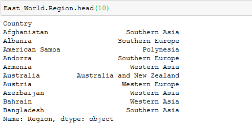
Regions in East_World dataset are shown above. They are not alphabetically sorted just like the numerical values. Now if you see the 2nd graph at the beginning of the post, the values on the x axis are not sorted either since they are not numerical values like those in the very first graph.
Hence the approach to find the placement to write the count values using text() is a different in this case.


Comments
Post a Comment
Hey there, feel free to leave a comment.