Corona Data Analysis
Datasets: https://www.kaggle.com/sudalairajkumar/novel-corona-virus-2019-dataset
Goal: Preliminary analysis - Graphical representation
After processing the dataset I got:

Plotting day-wise Corona affected patients count for each country:

Created a new datasets with just the Dates and Total count of affected patients.
Plotted day-wise total patient count

Created a new dataframe with addiional features like:

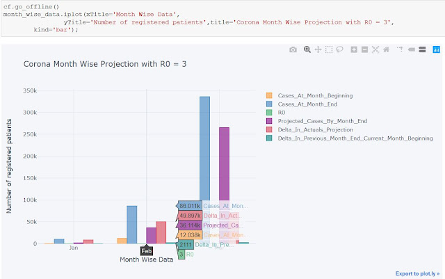
Plotting month-wise data : Bar Plot
Plot focusing on Italy's cases

Plot focusing on how the virus spread in the most affected countries at the moment (excluding China)

Goal: Preliminary analysis - Graphical representation
After processing the dataset I got:

Plotting day-wise Corona affected patients count for each country:

Created a new datasets with just the Dates and Total count of affected patients.
Plotted day-wise total patient count

Created a new dataframe with addiional features like:
- Number of cases at the month beginning and month end
- Projected cases by month end (using R0=3 and considering monthly spread rate)
- Difference in the projected and the actual count
- Number of patients increased/decreased from the last of of a month to the first day of next montth

Plotting month-wise data : Bar Plot

Plot focusing on Italy's cases

Plot focusing on how the virus spread in the most affected countries at the moment (excluding China)

Comments
Post a Comment
Hey there, feel free to leave a comment.